5 reasons for data storytelling: how to bring facts and figures to life
Imagine if data would speak and tell stories that the audience not only understands, but also feels. To turn this dream into reality, data storytelling is an excellent tool that anyone can use with a little practice.
Why data storytelling?
The challenge in the field of tension between data and storytelling is to extract the essence from an excess of information and present it in such a way that it triggers understanding, emotion and action. Researchers, journalists and companies often have a problem telling a story with all the knowledge they are sitting on. The video from Climate Science Breakthrough shows exactly what this discrepancy can look like. The organization has set itself the task of communicating complicated climate science in such a way that everyone can understand the noticeable change. You can see how here:
Personal stories + data = perfect match
Even though most people don’t understand the intricacies of data analysis, they still want to see numbers as evidence in many situations. Stories, on the other hand, are made up of personal anecdotes and experiences. The most powerful stories of our time are therefore those that combine hard facts with the perspectives of real people or organizations. In fact, countless stories can be hidden behind a single column of numbers. They just need to be discovered. The best-known search engine makes use of this expertly. Every year, Google uses its data insights to draw up a summary of the most popular search queries on the internet. And thus proves the beautiful quote by Brené Brown: “Maybe stories are just data with a soul.”
Data stories as a visual exploration journey
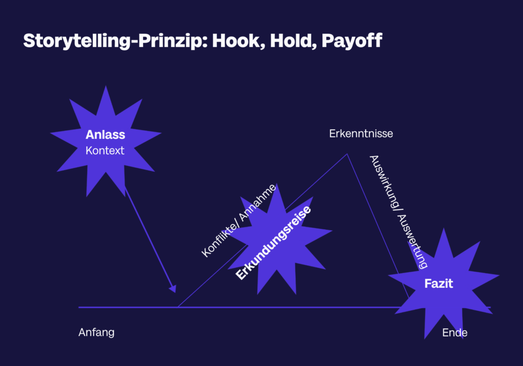
You should also remember the principles of hook, hold and payoff in data storytelling. Like a good story, a data analysis must have a beginning, middle and end. The beginning puts the data into context: What is the reason for looking at these figures? The middle section is about the exploratory journey: Where do conflicts arise? Are there any facts that call the previous assumptions into question? Which insights could have a direct impact on the lives of the target group? The final step is the conclusion: What impact does the content presented have? What is the message to the audience?
The example of Volvo Trucks shows what this can look like. The video initially arouses curiosity when little Sophie, as a test driver, explains what her job is today. She then steers the huge truck herself using a remote control. Everything that would otherwise be explained technically is shown on the screen during the hold phase. At the end, we find out that this Volvo is the most robust truck they have ever built. We probably wouldn’t have remembered the technical details, but the feeling after this visual illustration remains.
From Drill Down to Zoom Out: Storyplots for data stories
Storytelling is an important means of conveying analytical content to a non-analytical audience. Since numerate people are not necessarily the most emotional speakers, a framework can be very helpful. There are various story types that you can use for your data stories.
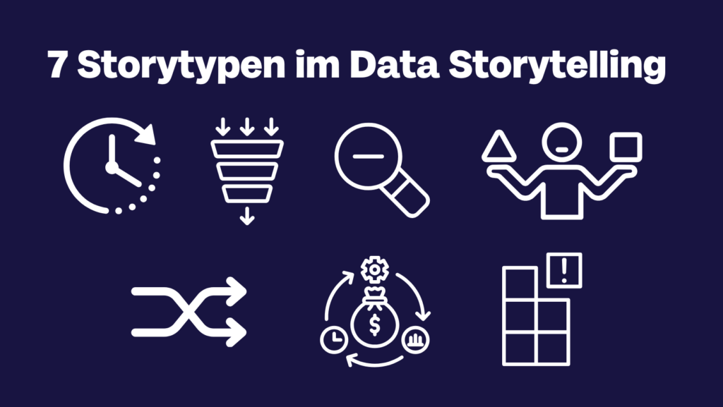
With the data plot “Change over Time”, for example, you address a transformation, the path from the old to the new world, as in the hero’s journey, but also possible reasons, turning points or predictions about the outcome of the story. The video by the late Swedish health expert Hans Rosling shows what this can look like as an interactive graphic, proving that even the most difficult topic can be made easily accessible and memorable when presented in an entertaining way.
Show, don’t tell: experience the differences for yourself
The motto “show, don’t tell” also applies to data storytelling in video form. Here are two examples in which you can literally feel the numbers.
What is the best way to explain “white privilege” to others? Perhaps by making them feel the differences. This is what happened to a British school class who only knew their starting position for a race after answering a few important questions and were thus visibly made aware of the unfair differences between them. But see for yourself…
What is a million? What is a billion? And how much difference do three zeros actually make? We can hardly grasp the contrast and cannot really imagine it if we only hear it as a number. If you want to experience the gap between the two amounts for yourself, you can do so by going on a drive. This much can be revealed: The difference is huge and you’ll have to bring plenty of time with you to experience the billion for yourself.
If you would like to learn more about data storytelling, we recommend our online course on the subject. It will teach you how to turn complex information into captivating images that stick in your mind .

Nora ist die Komplizin, die genau vor diesen wilden Fahrten nicht zurückscheut und neue Wege mit positiver Energie, mutigem Tatendrang und Siegeswille beschreitet. Nora lässt sich gern von der Aufregung des Moments anstecken; inspiriert, motiviert und unterhält aber auch gern andere.
Share this article