The Big Picture: Storytelling with Data
Humans love stories. They provide context and help simplifying complex theories – points, which also give data meaning. However, telling stories through numbers and analyses is another tale altogether. For many companies, data is indispensible for internal as well as external communication. The challenge is to filter the essence from the excessive amount of information, which then has to be presented in a way that evokes apprehension, emotion and action. To achieve this, it is helpful to stick to the principles of storytelling even in the area of Big Data.
A good start: Tangible data in the context
Just like a good story, data evaluation too should have a beginning, middle and an ending part. The beginning puts the data into context: what is the reason to engage with these numbers? The middle part addresses the exploration trip: where do problems arise? Are there numbers which question a previous assumption? Which findings could have a direct influence on the life of the audience? The ending forms a conclusion: which effect has the presented content? What is the message? Which meaning or moral can the audience take with them from the story?
The right narrative starting point: the audience and its prior knowledge
It is essential to know the audience and their level of knowledge: newcomers are having the first contact with the topic. Generalists know the topic already and only want a rough overview. Managers, on the other hand, want viable insights and need to be able to understand the relations well. Experts already have an extremely good understanding of the topic and are searching for the smallest new details. Based on that the important questions are: what does the audience already know about the topic? Which misconceptions might they even have? What could surprise them?
Report, forecast or solution: story plots with data
When the audience realizes that a story is a comedy it gets easier to classify the characters, symbols and plots. The same goes for storytelling with data: is the audience reading a report, a forecast or the solution to a problem? Standardized story plots help to categorize the respective data story and to filter out the most important findings. Therefore, it has to be clear from the beginning which story will be told.
Taking data-types into consideration: the right narrative perspective
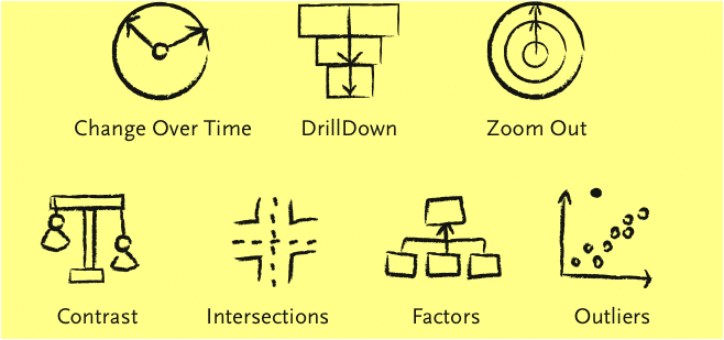
For the characters’ effects the narrative perspective is vital. Marketing Manager Ben Jones names seven types of data-stories:
- Change over Time, the depiction of transformation
- Drill-down, the explanation from the general to the specific
- Zoom-out, from the specific to the general
- Contrast, a direct comparison of two or more protagonists
- Intersection, describing the crossing point of one or more protagonists
- Factors, the visualization of the causal connection of multiple storylines
- Outlier, the story of outliers or special cases

Visualizing data and facts the right way: more than just pie charts
Last but not least, the data has to be visualized. There are a few basic rules to keep in mind. Colors should only be used to illustrate differences, not for visual “upgrading”. Too many details only distract and should therefore be excluded. Instead, blank spaces can be used deliberately. For the beloved pie charts too applies: less is more. Too many categories can quickly let them seem confusing.
Share this article


