Data Storytelling – A Guide out of the Numbers Nirvana
Do you remember the day when the teacher came to class with integral calculus? That’s exactly the moment when it started: From then on, numbers just had a bad image with me. There is supposed to be a small percentage of the population, probably a percentage of almost zero point zero, that is comfortable with data, statistics, or any indication of columns of numbers. For the rest, there’s a charming way to make data palatable even to number-avoiders and use it for your own PR and brand awareness: and that’s with data storytelling.

1,000,000 data, 1,000 faces and 1 goal
The nearest Sportcheck store is 65 calories from the train station instead of 300 meters. There are not 20 grams of fat in a medium-sized bag of popcorn in American movie theaters, but it has more fat than a breakfast of bacon and eggs, a Big Mac and fries, and a steak dinner combined. These two examples show that data can be really sexy and – above all – well packaged and understandable.
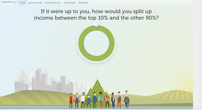
In fact, 1,001 stories are hidden in a column of numbers. They just have to be discovered. Every year, for example, Google uses its data insights to summarize a résumé of Internet users’ most popular search queries. The U.S. organization inequality.is real goes even further and has turned its entire website into a small data storytelling series.
Data visualization has many faces and just as many goals. In PR and marketing, the unpopular mathematical creature can be used to:
- Share insights, such as an annual report.
- Especially in the case of NGOs, motivate the target audience to take action
- To show personal perspectives
- To bring complex situations to the point
- And to offer orientation
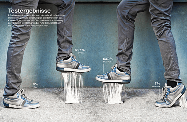
Contrasts, trends or outliers: The right packaging in data storytelling
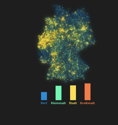
The biggest challenge in visualization work is choosing the right form for one’s data. For example, in-house insights can be used to show contrasts, as the weekly newspaper Die Zeit has already perfected. A good example is their interactive explanation of why the AfD was so successful in certain regions in Germany:
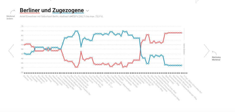
In addition, turning points can be pointed out. From a dramaturgical perspective, such depictions are particularly exciting because two or more protagonists come from different directions, meet at a certain point, and then diverge again. The great clash of powers, so to speak.
For the minimalists among the data newbies, there is also the possibility to use the so-called outlier from the numerical results. The advantage of this method is that the message of the data visualization is concentrated on the essentials. It directs the spotlight completely on what matters to the creators. The streaming service Spotify, for example, uses the listening behavior of its users to carry out charming advertising campaigns with the help of data storytelling.

The three examples mentioned are just a small overview of the variations that are hidden in the world of data storytelling. If you want to see even more potential, take a look at the videos by data god Hans Rosling. The TED Talks of the – now deceased – Swedish health expert with a penchant for data stories prove: Graphics don’t have to be a jpg file per se to reach the target audience.
A look into the many faces of data? Then take a look at Hans Rosling’s contribution.
Lost in Datavana?
The examples were all well and good, but how do you get there in the first place? Before you roll up your sleeves and get to work, you should be able to answer these questions clearly:
- Who is the audience I am speaking to?
- What do you want the audience to know or do?
- What does your audience already know about the topic?
- What misconceptions might they have about it?
- What can I surprise them with using data storytelling?
- How can I use data to make a point?
The answers are your anchor so that you don’t get lost in the data nirvana. At the same time, they help you to always keep your eye on the goal.
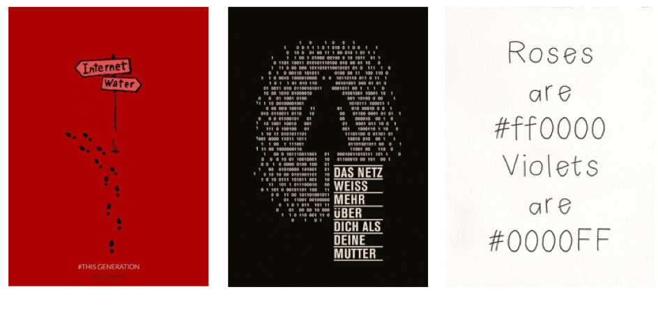
When it comes to data visualization, the golden rule is: less is more!
Brand storytelling: May the power of data be with you!
Although data analysis has had a bit of an image problem ever since Winston Churchill said, “I don’t trust statistics I haven’t faked myself,” the fact remains that if two values are presented in the right way, the target group can put one and one together and determine that two is exactly right for them. A good final tip follows from Cole Nussbaumer, who as Google’s head-of-data expert is surrounded by numbers all day long: “Don’t be a data fashion victim.” With all the creative options we have, it’s easy to get overwhelmed by graphics or other data visualizations. Again, less is more. The essentials are the best part of data storytelling, because the bottom line is that the target audience should be able to understand the graphic without any effort.
.
Share this article


